
Some insights on creating ambience – PRELUDE
Raffaele is a fantasy figure painter from Fidenza in Italy, I asked if he would give us some insights into the Mercenary figure he painted from Tartar Miniatures. The following is a short account of some of his musings (Ed).

creating the scene and choice of colours
“Hi folks, before starting with the “technical flow” let me introduce this work with a few words. I was born and raised with fantasy miniatures, with their freedom of colours and expression, with just one goal: to do my best.
After almost 20 years from the very first mini, I enjoyed trying to break down boundaries, the only thing I would care for was if the model matched my taste, I don’t mind if it was fantasy, historical or Sci-Fi.
MERGING THE GENRES
So here it is, an historical mini in the hands of a fantasy painter. Ok I prefer the more general models, those that could be portrayed as fantasy for instance, I am not keen on heraldry and historical clothing with patterns, mainly as I am not particularly skilled at freehand.
I really like this figure and enjoyed painting it so much: A fat mercenary with oversized, bulky armour. After some quick historical research (i.e.bothering other people in the know) I was safe: FREEDOM, and NATURAL colours, will be key to a great looking paintjob without having to worry too much about historical accuracy.
THE IMPORTANCE OF AMBIENCE

checking position and composition
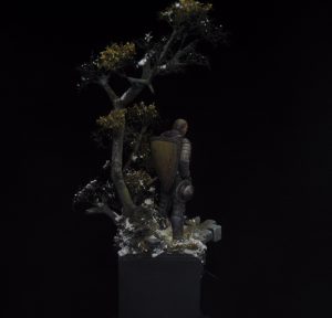
The only thing in my mind was the ambience and the season: nearly winter… or..early spring, with vegetation and a touch of snow (melting or just fall, you decide) and I wanted a tree and some “stones/bricks/etc. Mixing different kinds of materials can force you to push contrast with colours upon your base, for example, if I build a base with only trees or just “greyish stones” it will not be so much fun to paint, of course you can add moss on stone, but always plan and consider the different kinds of materials.
The trees have irregular surfaces, we have the leaves, fungi, algae, moss, on the other hand, stone can be smooth, squared, rounded, and so on; you can just make a green grass and adding a smooth rounded stone, and paint it with a colour that contrast the grass, simple, basic but effective, just look around you, nature is the best open resource you need.
With all that in mind I started the base: plaster for bricks and branches (or roots) for trees! (I wanted the bricks to look as if they were from a ruined street/bridge). To finish the trees I add some dry vegetation from railway modelling genre.
PAINTING THE BASE
I’m sorry but I don’t have any step by step images, I’l try to explain the process. First of all a black primer was applied with some zenithal white colour to help me identify direction of light and where to place my shadows. Again, the season, the colours, the temperature and contrasts.
Let’s suppose it’s early spring, you have the snow melting on the ground and on the trees, this causes humidity and the growing of moss and other small vegetation; the grass is almost yellowish but some green is coming through, some leaves are also on the branches, autumn leaves so they are yellow, orange, that make contrast with the dark grey of the tree.

mercenary
You can see some touches of green here and there, that’s the contrast I talked about, you can see, you can smell the edge of a country road, if you close your eyes you can also listen to the drops of melted snow.
You probably are waiting for my “recipe” a list of colours, is not a secret, but I don’t think it is important, colours are freedom. Just one rule: keep it natural, don’t look for super smooth transitions it won’t look natural, let your brush do quick strokes on the trees.Always with the zenithal light theory.
Just stop and think: is it a fantasy base or an historical one? Is just a natural base, you can imagine a powerful Elven King or a dangerous German mercenary from XV century!
COMPLETING THE PROJECT
harmonising the colours of base and figure together
After finishing the base I started thinking about the colours for the model. Natural was again the choice but with the idea they will fit in the base colours. This choice is most evident in the upper robe (some violet tones) and the shield a smooth yellowish colour with a warm touch of burnt red.
I don’t pretend to be exhaustive or to spend hours on talking abut mixing colours, I’m just a painter who like to share his works and his feelings; for me, there’s no better “side”, there’s just emotions, and the project could just as easily have been an Evil Necromancer as a WWII soldier.
I thinks of my style as taking “frames/stills” from movies, and when I see you looking at my works and wondering how and when, I know I have done my best.
See ya!!